EXECUTIVE SUMMARY
-
Value stock performance has gone through cycles that last about ten years, on average.
-
The current value upcycle could be one of the best, because the last downcycle was one of the worst.
-
An unfortunate combination of cycles recently produced the weakest 15 years for value.
-
Deep value is the only valuation quintile that is inexpensive relative to its history and may offer the best opportunity to achieve above average returns.
INTRODUCTION
Value investing was all the rage in the aftermath of the 1990s tech bubble. As technology and overvalued “nifty fifty” stocks imploded and took down the S&P 500, value stocks soared for years. Then, as the Global Financial Crisis began to develop, value stocks experienced the worst 15-year stretch we have on record. Stepping back and understanding the ebbs and flows of value cycles, we can see why that was such a poor period for value stocks. However, since March 2020 value stocks have been making a comeback. We make the case that we may now be in one of the best periods for value, and lacking exposure to value stocks could be a missed opportunity going forward.
VALUE GOES THROUGH CYCLES
When we refer to value stocks, we specifically refer to our definition, which is the cheapest quintile of the top 1,000 U.S. stocks by market capitalization. Using this definition, and looking at the returns of this cheapest quintile, we observe that value stocks have gone through performance cycles that last about ten years, on average. Since 1960, we have observed six different complete value cycles. We graphically present the length and cumulative outperformance of these value cycles in the chart below.
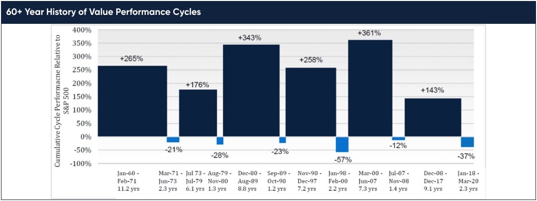
The upcycles have lasted 6 to 11 years with an average of 8.1 years. During these upcycles, the average annualized outperformance relative to the S&P 500 was 10.2 percentage points per annum. Downcycles have lasted 16 to 27 months with an average of 22 months. While short, these downcycles have been very painful, with average annualized underperformance of 16.6 percentage points. Through all these cycles since 1960, the length and strength of the upcycles has more than offset the brief but severe downcycles, netting 5 percentage points of outperformance per annum over the full period.
DOWNCYCLES STRONGLY CORRELATED TO NEXT UPCYCLE
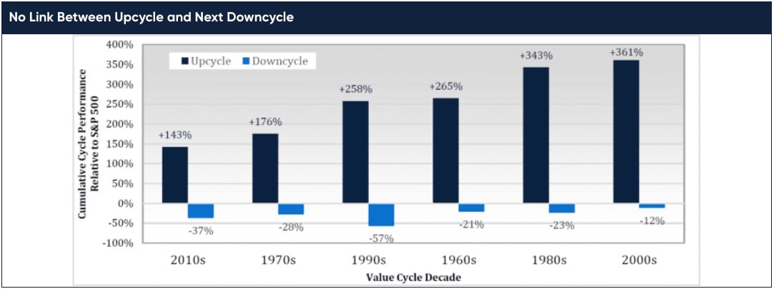
In studying value cycles, we notice a consistent relationship between the severity of the downcycle and the strength of the upcycle that follows. In the chart below we take the chart above and sort it by increasing severity of downcycle and label each cycle by the decade when it primarily occurred. We clearly see that mild downcycles have been followed by weak upcycles, and severe downcycles have been followed by strong upcycles.
UPCYCLES WEAKLY CORRELATED TO NEXT DOWNCYCLE
While the severity of a downcycle has been a good predictor of the strength of the next upcycle, the opposite
has not been true. In the chart below we take the same value cycle information but sort it by increasing strength
of upcycle. We do not observe any clear pattern between the strength of an upcycle and the severity of the next
downcycle. On the one hand, the strongest upcycle of the 2000s did lead into the mildest downcycle during the
GFC. But on the other hand, the worst downcycle (1990s) occurred after an average upcycle, and the second
mildest and second strongest upcycles both led into downcycles of comparable severity. If there was a correlation here, it has been a weak one. More likely to us, the severity of a downcycle is random.
THE LAST 15 YEARS
Lyrical exercised discretion in determining the dates of each cycle. Let’s step back and review the cycles of the last ~15 years. Starting in July 2007, in the days leading up to the GFC, value stocks entered a downcycle which ended in November 2008. This downcycle was brief at 17 months, and mild with only 12 percentage points of relative underperformance. To be clear, it was severe from an absolute return perspective as value stocks lost 50%, but the S&P lost 38%, so the relative difference was only 12 percentage points, which is very mild compared to other value downcycles in history.
Value stocks entered an upcycle in December 2008, and this upcycle lasted for just over nine years until December 2017. As the GFC downcycle was mild, and as mild downcycles have led to mild upcycles, this upcycle was the weakest we have seen since 1960. While the average upcycle has produced 10.2 percentage points of annualized outperformance, this upcycle averaged just 4.3 percentage points. As a result, the cumulative outperformance was 143 percentage points, which is a lot of outperformance, but just not a lot for the typical value upcycle.
In January 2018, value stocks began a new downcycle. At first it seemed like a mild one lasting 20 months, as value stocks began to recover in September 2019. But that recovery was short lived, when in February 2020 stocks sold off due to COVID pandemic fears. It now seems this value downcycle ended during March 2020, finishing as the second worst since 1960. Only the late 1990s technology bubble downcycle has eclipsed it in severity and matched it in duration.
UNFORTUNATE COMBINATION OF CYCLES
When you string these 15 years together, you have the GFC downcycle, followed by the weakest value upcycle, followed by the second worst downcycle. Value was not broken this whole time, as it still had a 9-year upcycle, but this unfortunate combination of cycles formed the worst 15-year period for value stocks in our data set.
We have looked at all the monthly 15-year rolling periods in our data set on value stock performance that goes back to 1960. We have 577 overlapping periods, starting with the 15-years of 12/31/59 to 12/13/74, and rolling month-by-month until 12/31/07 to 12/31/22. We display the annualized performance of value stocks relative to the S&P 500 for each of these 15-year periods in the chart below.
Overall, the average annualized 15-year return for the S&P 500 was 10.3%, while the average for value stocks was 16.3%, 5.9 percentage points higher. (Note: this is a different calculation than the average annual returns over the full period, as this is an average of rolling 15-year annualized returns).
It has been very rare for the cheapest quintile to underperform over a 15-year period. Value stocks have outperformed in 93.2% of the periods, and we have only recorded 39 periods in 577 observations when value stocks underperformed over 15 years.
These underperforming 15-year periods are all isolated to two eras. Eight ended in the Tech Bubble era, from the periods ending 12/31/99 to 8/31/00. The average underperformance was 0.5% and the worst underperformance was 0.9% for the period ended on 2/29/00. For a worst-case outcome, this is pretty good.
The other 31 occurrences happened more recently during 15-year periods ending 3/31/20 to 9/30/22. Not only was this recent range almost 4x longer than the one during the Tech Bubble, but it was about 2x as severe. The average underperformance was 1.0% and the worst underperformance was 2.1% for the period ended on 9/30/20. Again, not bad for the worst 15-years since 1960, but still 8 percentage points worse than the +5.9% average outperformance for the full data set.
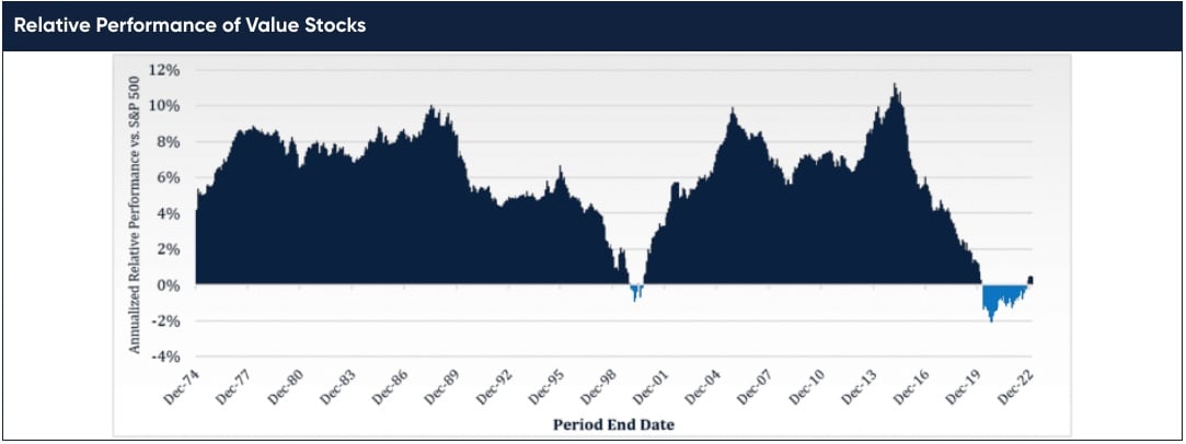
We have only discussed the average and worst 15-year periods, so far. Looking at the chart it is obvious that most 15-year periods delivered strong outperformance for value, but when was the very best 15-year period? As you may have guessed, the best 15-years started right after the worst 15-year period ended. From 2/29/00 to 2/28/15 the cheapest quintile returned 16.2%, outperforming the 4.9% of the S&P 500 by 11.3 percentage points per annum. We view this as a strong indicator for the next 15 years.
LOOKING FORWARD
We recently exited the worst 15-year relative return environment for a value investor that stuck with their discipline and didn’t drift into owning higher multiple GARP or growth stocks. Therein lies the danger in making future allocations based purely on returns of the last 15 years. Doing so may overstate the attractiveness of non-value strategies and understate the future potential of deep value strategies.
This possible reversal from the last 15 years is also supported by current valuation levels. In examining past equity performance, it is useful to separate how much was driven by fundamentals (earnings growth) and how much was from multiple change (valuation). An equity return stream that outpaces its fundamentals will get more expensive, at the likely cost of future returns.
While not ironclad, there is an incredibly strong relationship between future returns and current valuation. The cheaper the starting valuation the higher the future returns, and the more expensive the starting valuation the lower the future returns. This relationship is weak for short-term returns, but as you extend to longer and longer periods, from 5 to 10 to 15 years, the relationship grows stronger.
Looking at valuation at the end of 2022, we see that most of the top 1,000 U.S. stocks are expensive relative to their historical valuation. The only exception is deep value stocks.
In a piece dated January 10, 2022, titled “Memo to The Investment Committee: A Hidden Gem1,” GMO produced a graph of where each valuation quintile of the top 1,000 U.S. stocks stands today versus its history. The cheapest quintile (“Deep Value”) is very cheap, and at year-end 2022 was in the 6th percentile of its history going back to 1983. It was the only quintile that was cheap versus its history. The next highest valuation quintile (“Shallow Value”) was in the 77th percentile, the middle quintile was in the 97th percentile, and the two most expensive quintiles were in the 87th and 85th percentile. Again, all of the U.S. market is expensive versus history, except deep value.
Nobody knows the future, and we acknowledge our favorable bias toward value stocks. That said, we think there is a good chance we have re-entered an era of value stock dominance. Furthermore, we may be in an environment where everything generates below average returns, except deep value stocks.
Entering 2023, we encourage you to reevaluate your current allocations to value, and just as importantly, examine whether that exposure is to deep value, and not to an index tracker or style drifter. There are not a lot of us deep value adherents left after those tough 15 years, but as they said on the Oregon Trail: “The cowards never started, and the weak died along the way – that leaves us.”
1 https://www.gmo.com/americas/research-library/memo-to-the-investment-committee-a-hidden-gem_insights
Chief Investment Officer